Your StoryBrand blueprint: Everything you need to know about a StoryBrand website
Hi, I’m Ben! 👋
I’m a StoryBrand Certified Guide and the founder of StorySite. We help people create awesome StoryBrand sites with our website templates.
What is a StoryBrand wireframe?
A website wireframe is a rough layout of a website that includes the written words that will be used on the site. A StoryBrand website wireframe is a specific layout that includes all the components that most companies should include on their homepage. The goal of the wireframe is to communicate clearly and cause the reader to take action. It is your blueprint to building a storybranded website.
About StoryBrand 💡
StoryBrand is a company founded by best-selling author Donald Miller that promotes the idea that being extremely clear in your marketing is the best strategy to grow your business.
What are the sections of a StoryBrand wireframe?
There are 10 sections in a StoryBrand wireframe. Each one is designed to guide the reader through a story.
It’s not a story about you or your company.
It’s a story about your reader. They’re the hero, and you’re the guide that helps them win.
Let’s take a look at the recommended sections:
The Header Section
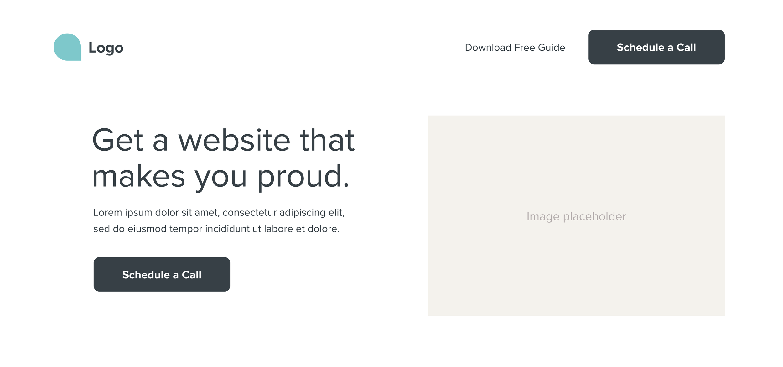
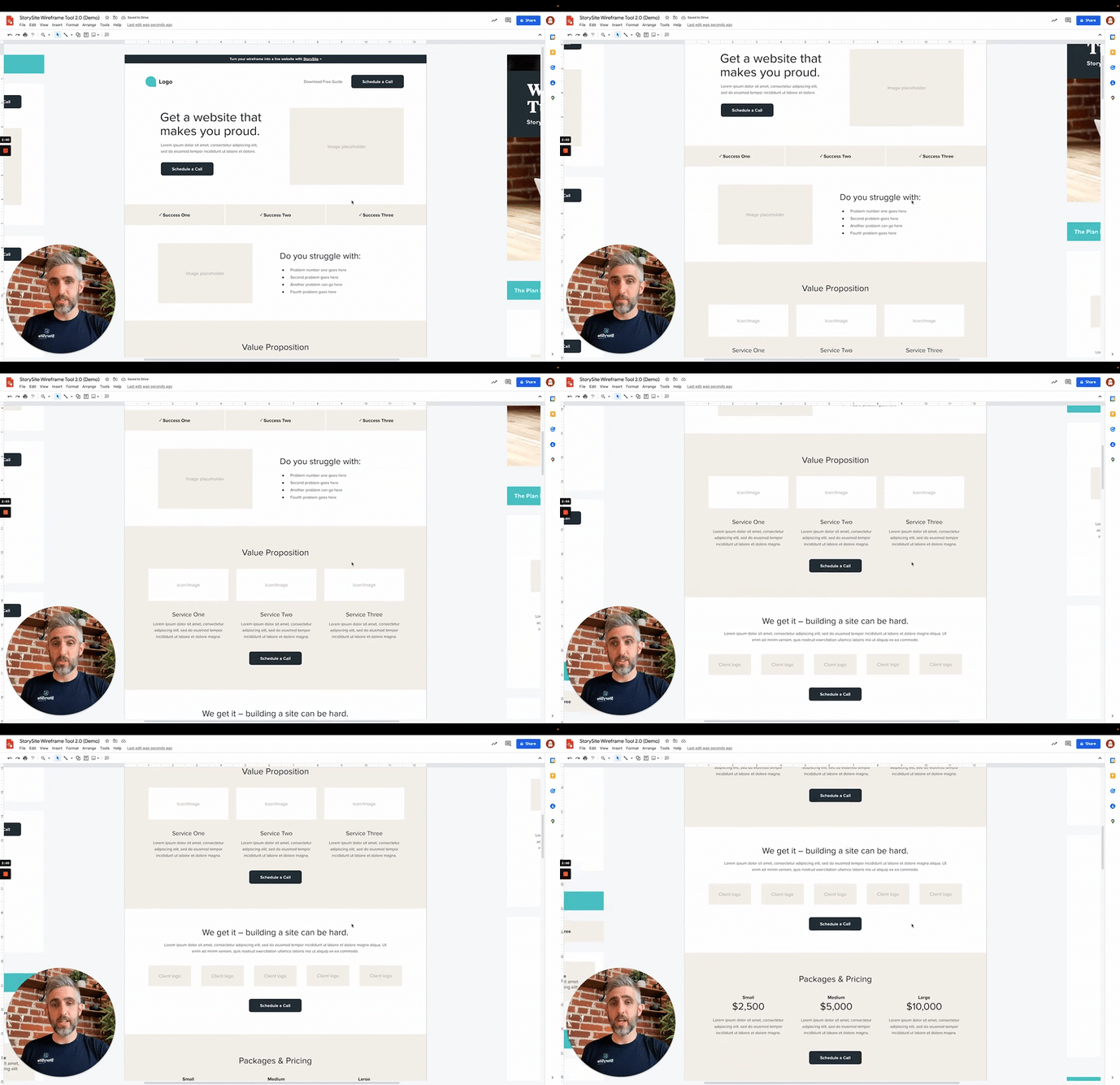
As you can see in this screenshot of our wireframe tool, the header of your StoryBrand wireframe should include:
Your logo at the top left
A large, clear statement of what your customer wants. (e.g. “Stay on top of your finances”)
A clear description of what you do as a company (e.g. “Bookkeeping and financial forecasting for restaurants”)
A call to action button (e.g. Schedule a Consultation)
An image showing a happy customer experiencing success using your product or service
The Value Stack Section
The value stack should list three simple successes that your customer will experience if they choose to work with you.
The purpose of this section is to help readers see how your company can make their life better. This helps increase the perceived value of your product or service.
Here’s an example of three successes:
Stop stressing
Stay organized
Save time
The Stakes Section
In this section we want to show the reader that we understand their problems and how critical it is to solve those problems.
Here’s an example of problems your customer is experiencing:
Your receipts aren’t tracked properly
Tax time is always a headache
You’re afraid you might run out of cash reserves
You don’t have time to deal with it
The Value Proposition Section
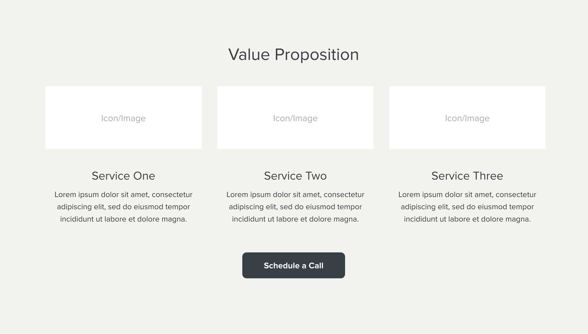
The purpose of this section is to present the value that you can provide to your reader. This could include a few of your services, or it could be three benefits of working with you and a single sentence about each.
Example value proposition:
Bookkeeping (with description)
Financial Forecasting (with description)
Monthly Check-Ins (with description)
The Guide Section
In this section we want to show empathy for our reader and demonstrate that we are the experienced guide they need in order to succeed.
What to include in the guide section:
Empathetic statement (e.g. “We understand that finances can be overwhelming”
Customer testimonials and photos
Alternatively you could show logos of clients you’ve worked with, press logos, or certifications
Remember, the goal is to show that you have the authority to solve their problem without bragging about yourself.
The Packages & Pricing Section
If you display your pricing or packages on your website, here’s an opportunity to do so. If not, you can skip this section.
The Plan Section
The goal of the plan section is to make the next steps to work with you as clear as possible. People feel more comfortable when they can see what’s going to happen next, and will be more likely to take action.
Here’s an example:
1. Schedule a Consultation
2. Choose a package
3. Get on top of your finances
StoryBrand recommends that you make the third step a positive success so it’s easy for the reader to see the steps to getting to where they want to be.
The Explanatory Paragraph Section
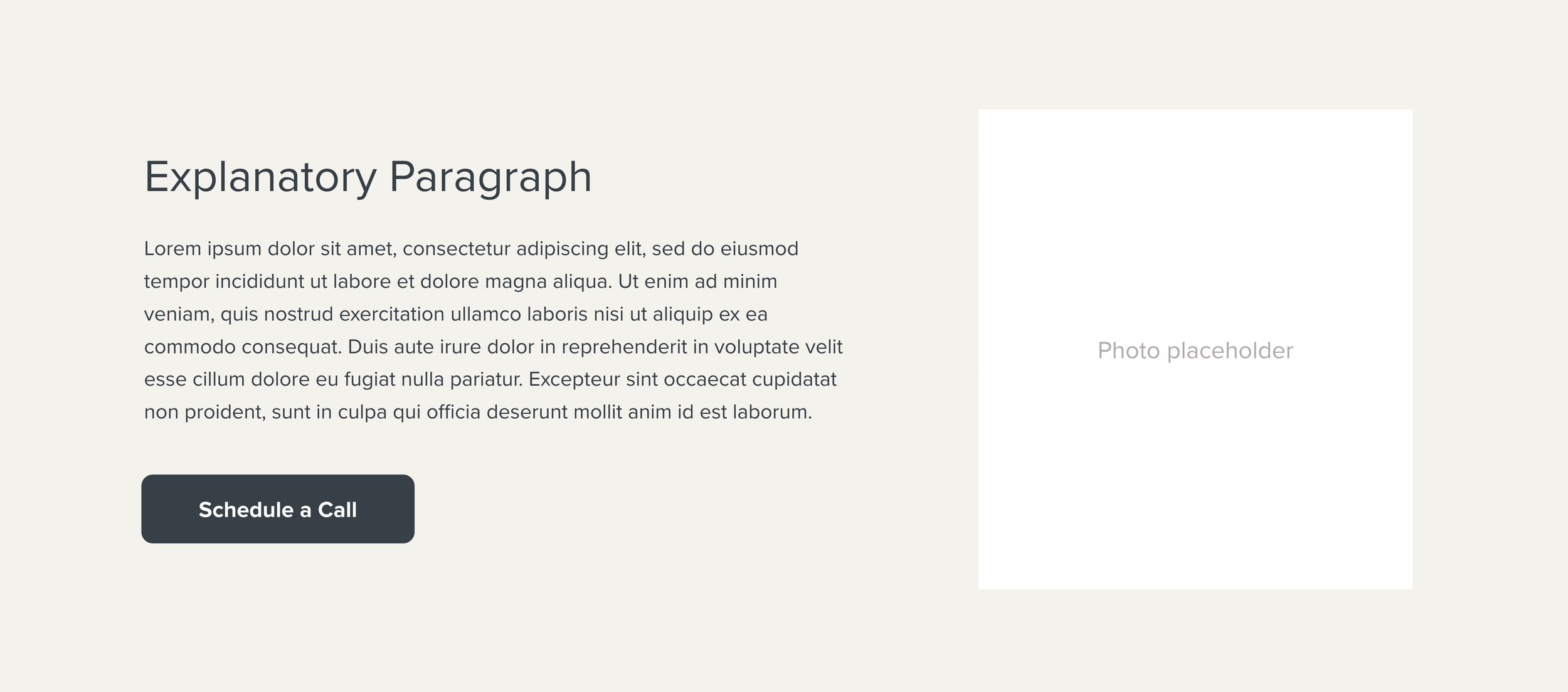
This section is a short paragraph where you state the problem that your customer faces, the solution to their problem that you offer, and the success they’ll see when they work with you.
Here’s an example of an explanatory paragraph:
“At Acme Bookkeeping we understand what it’s like to feel stressed about finances. That’s why we created hassle-free bookkeeping services. So you can stay on top of your finances and focus on what you do best.”
The Lead Magnet Section
This section is designed to help you capture the email address of your reader. Even if they’re not ready to buy from you now, they may be interested in a free resource you can provide.
The idea is to create a resource that helps solve a problem that your reader is experiencing. You can follow up with an automatic email sequence to up-sell them in the future.
Examples of lead magnet titles:
9 easy tips to keep your restaurant finances in order
4 unexpected ways your restaurant can increase profits
Self-evaluation: Our 15-point restaurant finance checklist
The Footer (aka Junk Drawer)
StoryBrand recommends that you put any additional pages and links into the footer so that you don’t distract readers with too many options in the top navigation.
The idea is that the reader will scroll down the page and read the copy instead of jumping around your website.
This is the perfect place to add your internal page links, privacy policy, social media links, copyright info, and more!

Best practices for creating a StoryBrand website wireframe
Clarity is better than creativity
Remember that it’s more important to be clear about what you offer than to impress readers with big words or clever puns.
Keep it short
Err on the side of writing less, not more. Most people tend to write more than they need to on their websites. It’s ok to go into more depth on other pages of your site, but a StoryBrand wireframe needs to be concise and to the point.
Focus on the words, not the design
It’s easy to get distracted by picking fonts, colors, and images when you’re building your wireframe. Try to stay focused on writing the words. Once you have the words finalized, then you can think about the design of your site. Doing both at once can be confusing and slow you down!
Get inspired by others
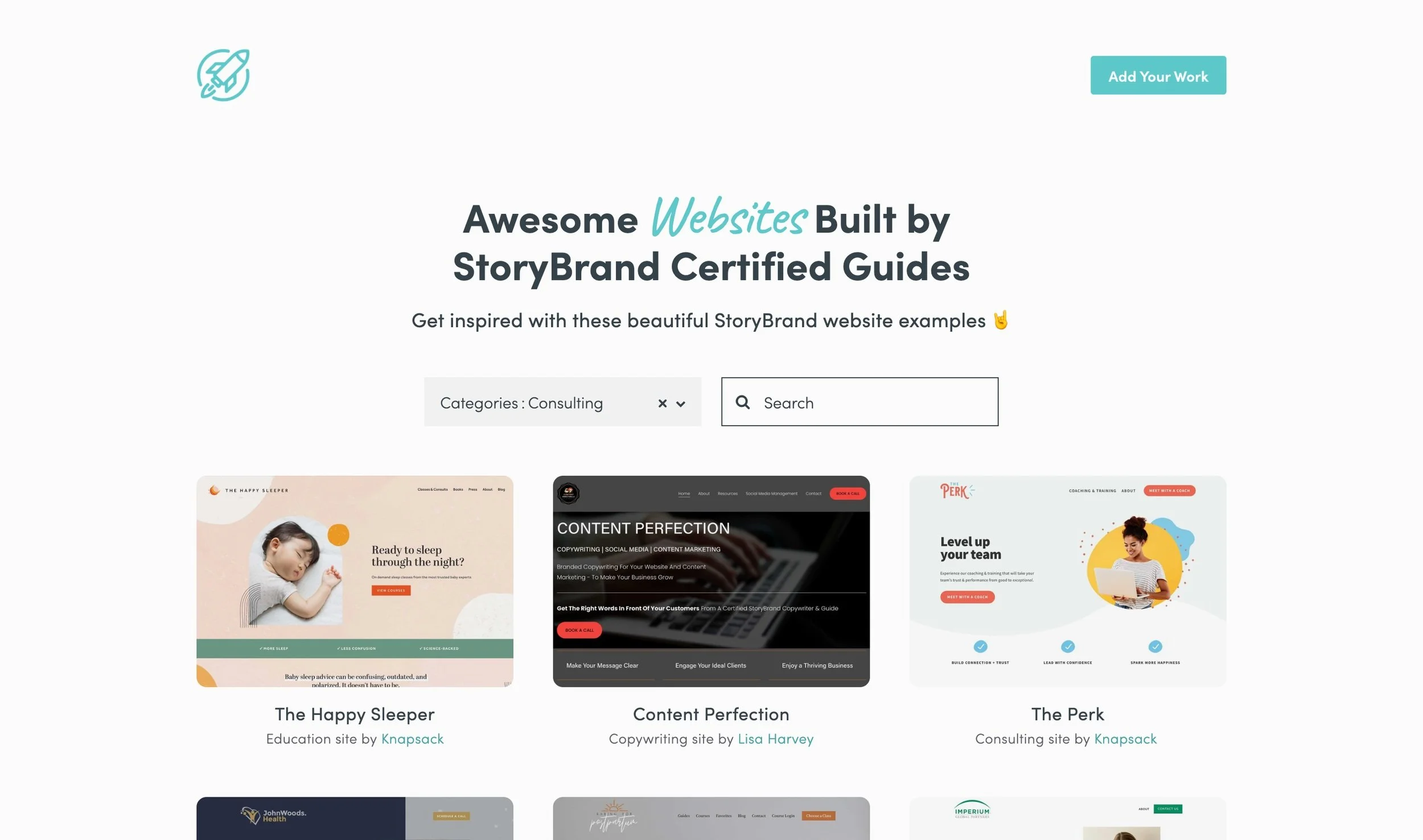
If you feel like you’re stuck, check out this collection of awesome websites built by StoryBrand Certified Guides. The password is betheguide. Browse by industry, and you’re sure to find some ideas on how to make your wireframe better!
Create your own StoryBrand wireframe with our free tool
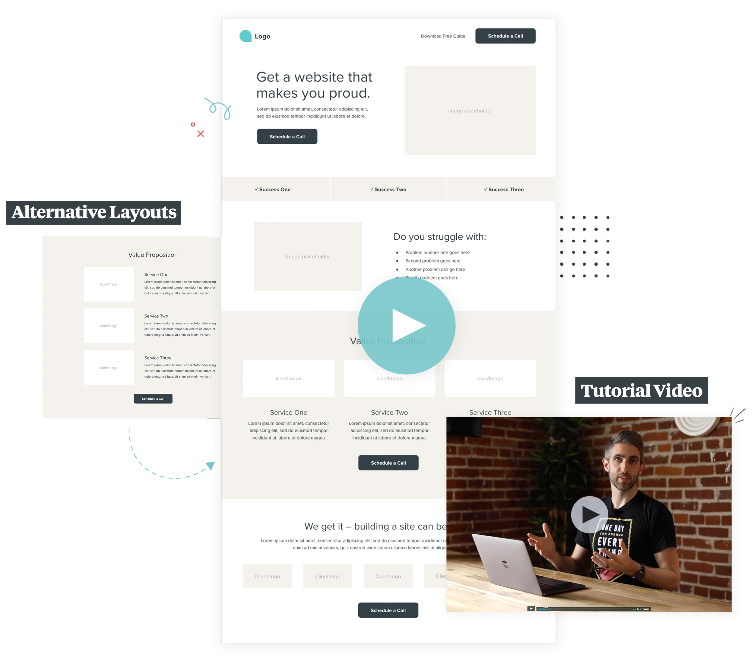
We’ve created an easy-to-use free tool that has all of the StoryBrand-recommended sections already laid out and ready to fill in with your copy!
Here’s how to get started:
1. Get free access below
2. Watch this tutorial video if you get stuck. Enjoy!
A quick tour of our free StoryBrand Wireframe tool and how to use it.
How to turn your StoryBrand wireframe into a real website
When you’re done creating your wireframe you’ll want to turn that clear message into a beautiful website.
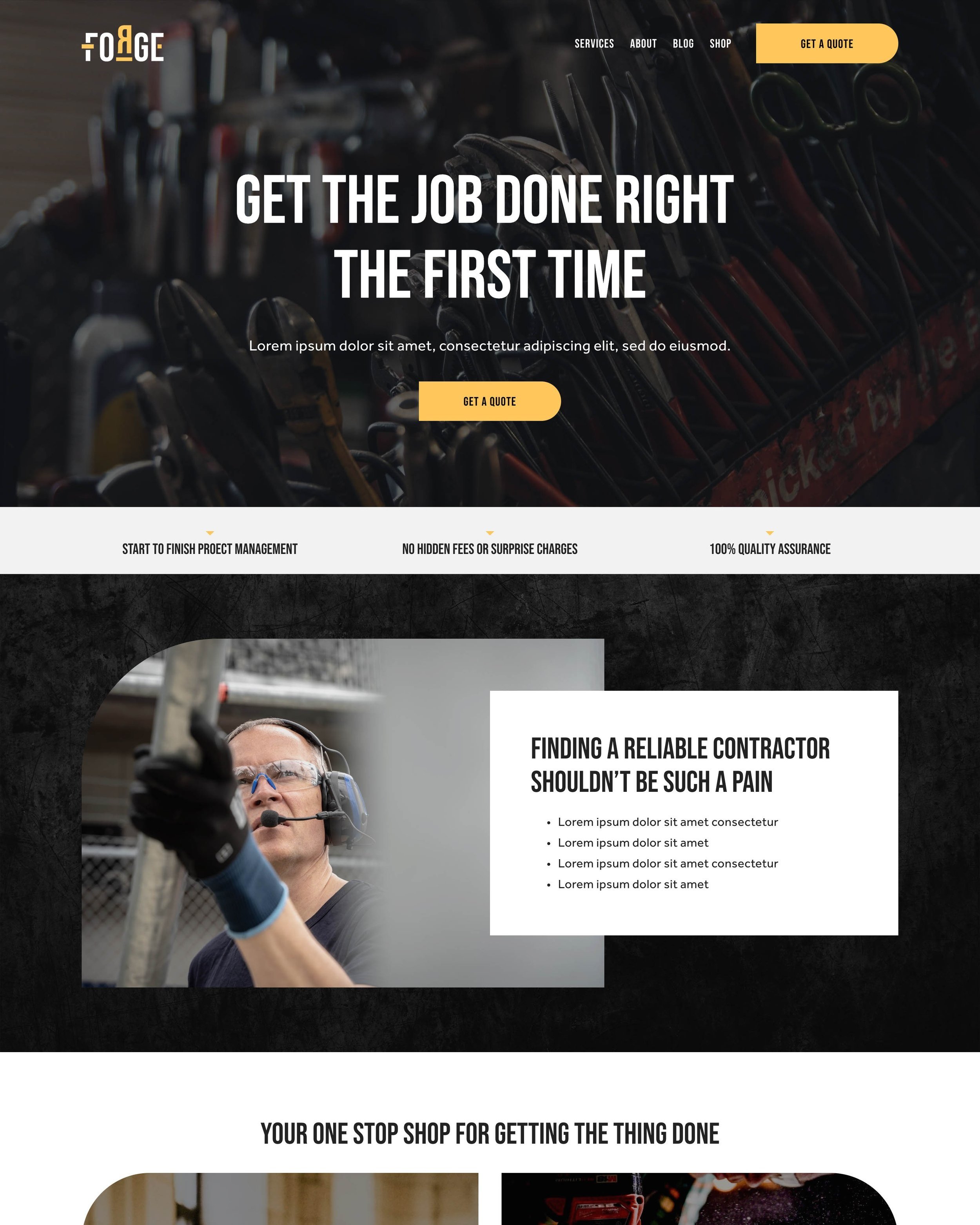
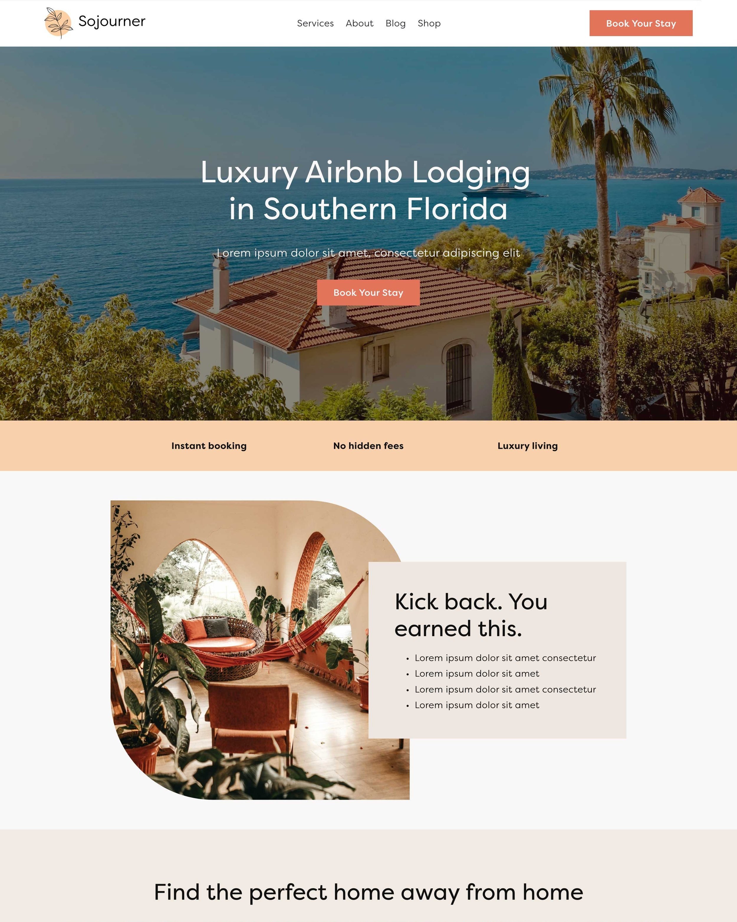
Here at StorySite, we’ve created a collection of StoryBrand-ready Squarespace templates that can help you go live, even with a limited budget.
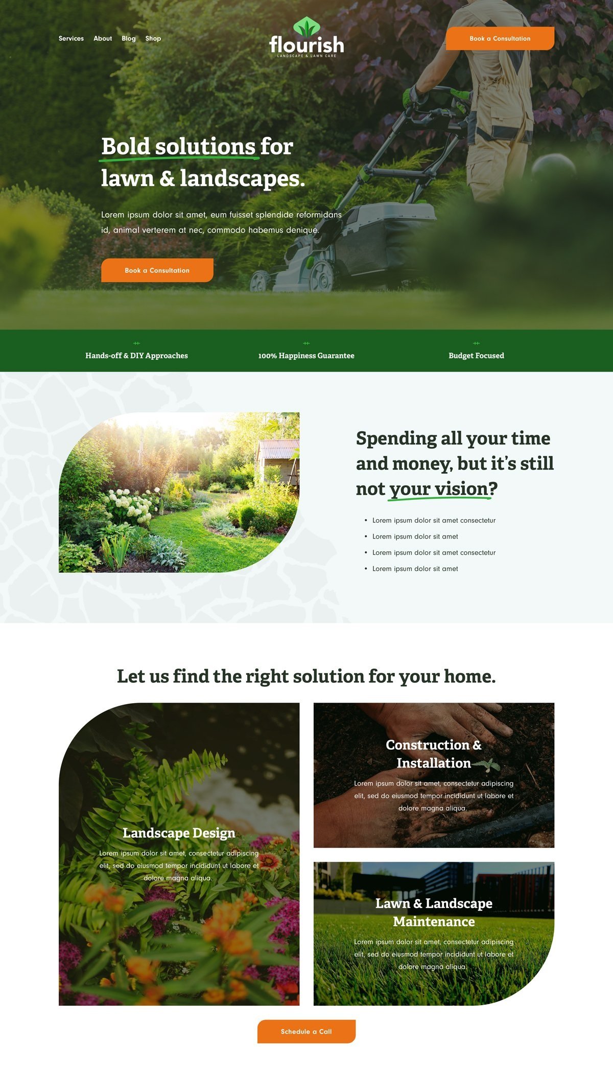
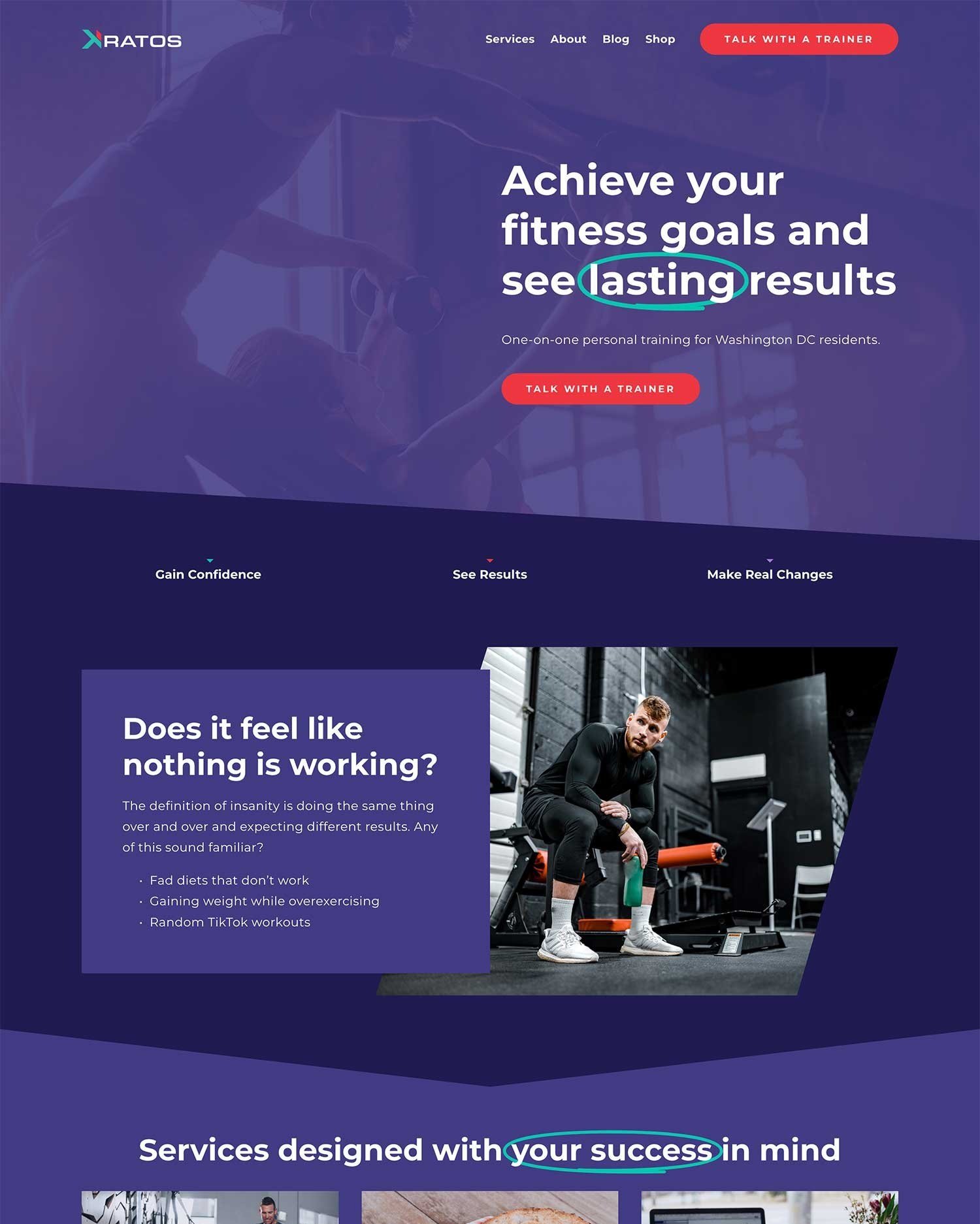
Here are a few of our latest template designs:
Looking for something more custom?
Our main agency, Knapsack builds custom Squarespace sites for businesses all over the world. Our designers are familiar with StoryBrand and will make sure to build you a gorgeous website that makes you proud.
Check out these examples of custom StoryBrand websites we’ve built for businesses like yours.

